Assemble UI
React Component Library Platform
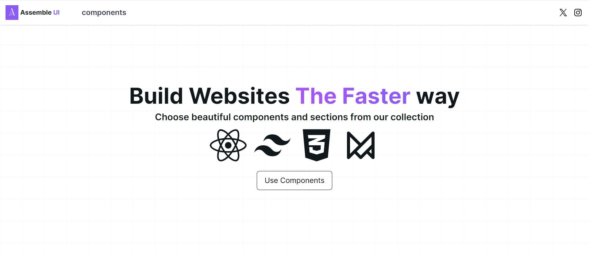
The Goal
Build a public platform for developers to discover and copy ready-to-use React components built with TailwindCSS and Motion, reducing the time it takes to build polished UIs from scratch.
Key Highlights
- Live interactive component previews with one-click copy
- Growing open-source library of TailwindCSS + Motion components
- MDX-powered documentation for rich component pages
The Problem
Developers building with TailwindCSS and Motion often need to build animations and interactive components from scratch each time. There wasn't a dedicated resource that offered high-quality, copy-pasteable components specifically designed for this tech stack combination.
The Solution
Assemble UI is a component library website that showcases interactive, animated React components with one-click copy functionality. Each component is designed to work immediately within any TailwindCSS + Motion project.
Architecture
Built with Next.js for the platform itself, with MDX for component documentation pages. Each component is rendered in an interactive preview with a code view. The site is deployed on Vercel with automatic deployments from GitHub.
Implementation Details
- 1Built an interactive component preview system that renders live components alongside copyable code.
- 2Used MDX for component documentation pages allowing rich content with embedded live demos.
- 3Implemented a code syntax highlighter for readable code blocks.
- 4Designed and built a growing library of animated components using TailwindCSS + Motion.
- 5Structured the platform for easy contribution and addition of new components over time.